|
|
|||||||||||||||||||
1983 - THE CORNER SERIES OF DAVID SORENSEN ('The Corner Series' catalogue 1983)
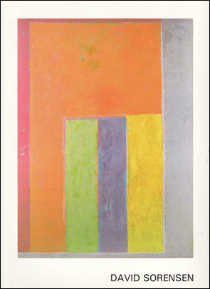
David Sorensen belongs to a generation of painters who are breathing new life into abstract art. This art form, particularly since the late seventies, is suffering from inner doubts and is at war with itself. The concept of abstraction became a matter of conflict between the relative importance of the subjective and the objective approach to painting. On one side stood the defenders of emotion, by way of action painting; on the other, the followers of hard edge and minimalism with their dour detachment from feeling. Abstraction was thus fast being pushed towards an aesthetic dead end. A number of young artists, however, remain convinced that abstraction’s fate should not be settled by sectarian attitudes and that its possibilities as a vehicle for creative expression are far from exhausted. They deliberately turn their backs on theories which they consider to be mutually antagonistic and essentially destructive. They seek out and chart new paths. As did these painters, Sorensen never hesitated to work in the abstract idiom. His aim is to break new ground by pushing the opposing tendencies even further ahead until they meet and mingle on his canvases. He gives them free rein. Thus he achieves his aim not by downgrading two contrary aesthetic modes, in an attempt to make them compatible with each other, but rather by allowing them to be supportive of each other. They lose their stridency in this manner in exchange for a transformation in depth. The painter subjects the contrasting theories to a process of fusion, fueled by his distinctive style of composition and colour. The three fundamental ingredients of abstract painting, colour, shape, and structure are given unequal roles in David Sorensen’s work. The artist assigns the first and foremost place to colour. Shape and structure, while by no means neglected, are made subservient to it. David Sorensen, by temperament, training and technique, elects to glorify colour above all things. The firmness and clarity of his decision bring character and strength to his paintings. Since colour is of primary concern in Sorensen’s work, a few words on the subject may be in order. Colour is much more than a painterly effect or a means by which shapes are made visible. Colour possesses a language, a body of ideas, a sense of significations. The term “language “ is used advisedly. A dictionary tells us that language is “a systematic means of communicating ideas or feelings by the use of conventionalized signs, sounds, gestures, or marks having understood meanings”. Colour is such a mark.
Since time immemorial, colour has been given cognitive and cultural functions. In ancient Rome, those who aspired to public office wrapped themselves in white togas to proclaim their availability, a custom which gave us the word candidate. Bridging the centuries, today in Germany and elsewhere we meet the “Greens”, who enshrine in this colour, associated with the idea of hope and rebirth, their message of sociological and ecological concern. Numerous forms of communication - flags of all kinds, traffic signals, - rely on the direct impact of colour for instantaneous understanding, coupled with emotional or practical reactions; but let these examples suffice. David Sorensen’s colours are essentially a source and a symbol of pleasure. Sensitively applied on canvas, or floated on paper, they appear to emit light. At first glance one perceives them individually, entirely on their own. A second look reveals their association with each other. Sorensen’s paintings come to be seen as groupings of colours, existing side by side in quiet harmony or in complementary contrast. The colours are clear and distinct, yet not hard. Their surfaces and edges are shaded but cannot be called soft. They lack the brushwork overlaps of action painting as much as the cool neatness of hard edge. Yet, they are not the result of compromise or adjustment. They assume a character all their own. The glow of each single colour shines over the whole canvas. The painting, in turn, becomes the product of this composite glow. Sorensen creates colours with such subtlety that they seem to be additions to the known colour repertoire. In their novelty they speak of joy, they radiate sensuousness.
Much of the moving effect of Sorensen’s colours is due to the artist’s feeling of dosage. Call it shape, call it structure, call it composition, in the end it all comes down to proportion. Sorensen determines a colour’s dimension and placement on his canvas by its degree of tension. The interaction of such tensions constitute the work of art. The viewer confronts a degraded blue or a heightened orange, for instance, without being able to fit the tints into a clear referential colour scale. Sorensen’s colour scheme, or better yet colour development, is one of deceptive imprecision. The tension alluded to is brought about by the contrast between a person’s reassuring memory of colour and the actual perception of change and elusiveness. Sorensen’s paintings are never symmetrical in appearance. They contain repetitive shapes, essentially rectangles filled with colour, disposed in a rhythmical pattern on a vibrant background. Their sizes vary and also their groupings. Always off centre, to one side or the other, towards the top or towards the bottom, Sorensen places ensembles of intense colours which may at first shock the viewer. The soft stabilizing effect of larger tinted masses soon restores the balance of feeling emanating from the painting. The artist’s preference for the rectangular shape and the right-angled volume allow him an infinite variety of combinatory colour selections. With every painting he brings forth new colour schemes, new interplays of shapes and tints, new designs. Sorensen is instinctual without being lax, he is intellectual without being rigid, he is emotional without being aggressive, he is careful without being shy. Nature is the great unifying spirit of colour and shape in David Sorensen’s most recent paintings, the Corner Series. This is not to say that his earlier work was not similarly inspired. The expression is now, however, more intense and definite. Born in British Columbia, David Sorensen surely carries memories of the overwhelming presence of nature in that part of the world. The intensity of the greens, the blending of land with sky and ocean, the massive clouds and fogs which blur and unblur mountains and valleys, have left a deep imprint on Sorensen’s creative spirit. Mexico, where he spent quite some time, has contributed to the artist’s colour sensitivity. He carries within himself the vision of pastel baroque church facades, set against the brilliant blue and white of Mexico’s light and sky. He surely has not forgotten the innate colour sense of Mexico’s country people, whose dress, outside house paint and decorative feeling are like a frame to nature itself. It must nevertheless be said that Sorensen does not paint from insight alone. He is knowledgeable about art in all its aspects. He can draw on a reserve of information which puts him in touch with the work of major artists who have devoted, as he has, their best efforts to an understanding of the language expressed by colour In conclusion, Sorensen may be called the inventor of a new colour terminology. He comes closer than any Canadian painter of our times to giving colour a presence untouched by anecdotical or compositional references. To give colour an absolute presence, as if it were atmospheric and not tied to a support, has been the aim of many an artist. Sorensen subscribes to this aim, but wisely acknowledges that it is unattainable. In his paintings support and colour come together, neither has the upper hand, yet neither intrudes upon the other. Good paintings speak for themselves. Descriptions and comments are but approximations of the real things. Sorensen’s vision, embodied in his works on canvas and on paper, brings forth painting of such immediacy that indeed they require no explanations or art historical references. Such is the language they speak, such is the joy they transmit. |
|||||||||||||||||||